
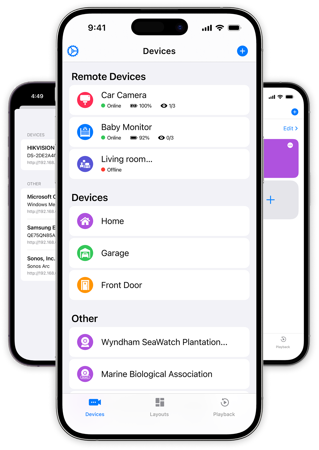
Overview: UniCam was created to meet the growing demand for a simple, secure, and efficient solution for remote IP camera monitoring across multiple platforms.
Role: UX Researcher, UX/UI designer, Brand designer
Industry: Security
Toolkit: Figma, Adobe Photoshop, FigJam, Pencil and paper
Why UniCam was developed to simplify remote camera monitoring.
How understanding user needs shaped the app’s core functionalities.
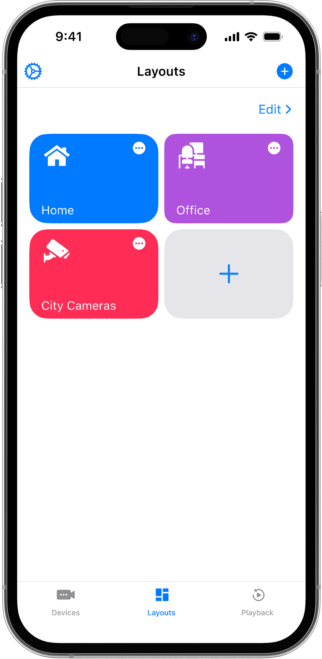
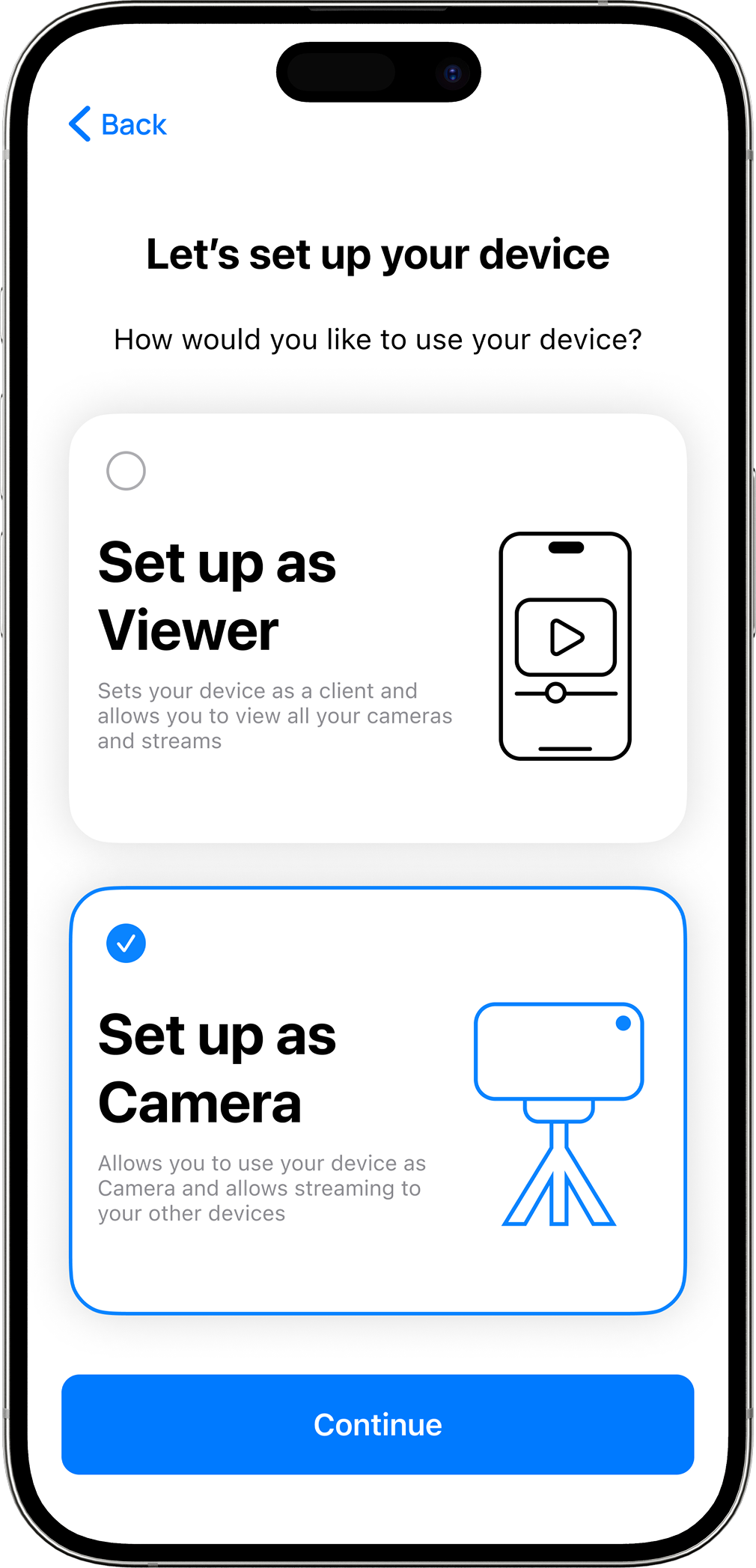
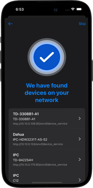
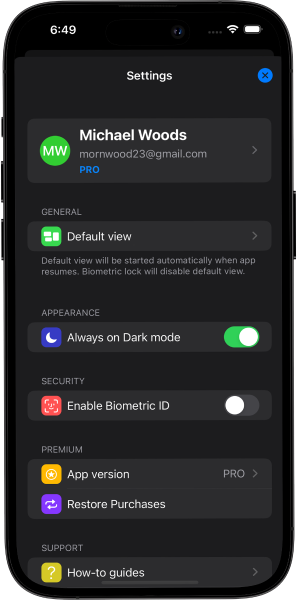
Exploring the user flow and structure built for ease of use and fast access.
Discovering the visual approach designed for clarity, control, and reliability.
Overview of testing sessions, user feedback, and key improvements made.
Reflection on lessons learned about designing for security and multi-platform compatibility.
UniCam was created to meet the growing demand for a simple, secure, and efficient solution for remote IP camera monitoring across multiple platforms. Developed by Nittbit, the app was designed for users who needed easy access to their surveillance systems without dealing with complicated setups or platform limitations.
Simplify camera management with automatic discovery and easy configuration.
Provide reliable, real-time access to live feeds and recorded videos.
Ensure flexibility by supporting iOS, iPadOS, Android, and TV devices.
Prioritize privacy and security, ensuring that sensitive footage stayed safe and encrypted.
Support different user scenarios, from home security and pet monitoring to mobile dashcams.
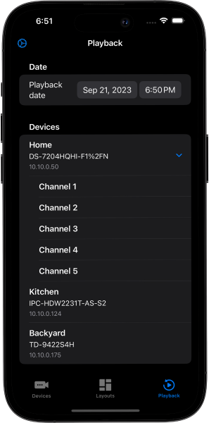
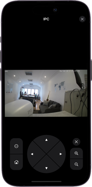
By offering powerful features like ONVIF protocol support, multi-view layouts, and PTZ camera control—all within a clean and intuitive interface—UniCam aimed to make high-quality surveillance accessible to everyday users, not just security experts.
Before starting the design process, research was essential to understand the expectations and pain points of people who manage IP cameras for home and small business use.
Trainers were using separate tools for workout plans, nutrition guidelines, client chats, and progress tracking, which led to lost time and miscommunication.
Many trainers struggled to grow their online client base because managing multiple clients manually was too time-consuming.
Without automation, it was difficult to offer truly personalized programs at scale.
Trainers noted that clients often lost motivation without regular, streamlined communication and progress feedback.
These findings guided the core priorities for the app:
Centralizing program creation and client management
Integrating a messaging system directly into the app
Using AI to assist trainers with faster, personalized plan creation
Ensuring clients can easily track their own progress and stay motivated
By directly involving real users early on, the project stayed grounded in solving authentic problems rather than assumptions.
With a solid understanding of user needs from the research phase, the next step was to design a seamless and intuitive user experience. The primary goal was to create a flow that made it easy for trainers to manage clients, build personalized programs, and track progress, all in one place.
I started by mapping out the user journeys for both trainers and clients, identifying key actions and touchpoints within the app. This involved outlining the steps trainers would take to create a new workout or nutrition plan, communicate with clients, and review progress. For clients, the journey focused on how they would interact with the app to receive their personalized plans, provide feedback, and track their results.
From there, I created low-fidelity wireframes to visualize the basic structure of the app. These wireframes helped establish the core layout, ensuring that the app would be simple and easy to navigate. Key principles considered during this stage were:
Ensuring users wouldn’t feel overwhelmed by too many options or cluttered screens. Key actions were grouped logically, and the navigation was simplified.
Important tasks, like creating programs or checking client progress, were made easily accessible from the dashboard.
I ensured that similar actions (e.g., adding new exercises or adjusting a workout) were consistent across different parts of the app for a smoother experience.
By continuously iterating on the wireframes and keeping user goals in mind, I was able to design a layout that minimized friction and provided the best flow for both trainers and clients.
The UI design phase focused on bringing the wireframes to life with a visual style that aligned with the app’s dark mode theme, while maintaining clarity and ease of use. The goal was to create a clean, inviting, and user-friendly interface that encouraged focus without distractions, even in low-light environments.
Lorem ipsum dolor sit amet, consectetur adipiscing elit, sed do eiusmod tempor
Lorem ipsum dolor sit amet, consectetur adipiscing elit, sed do eiusmod tempor
I chose a dark theme with black as the primary background color and green as the accent color to evoke energy and motivation. The dark mode reduces eye strain and helps the key elements, like buttons and progress indicators, stand out more clearly. Green was used for key action buttons, highlights, and progress indicators, adding contrast against the darker background for better visibility.
For typography, I selected modern, sans-serif fonts that remain legible in low-light conditions. Lato and Montserrat were used for headings and body text, with subtle weight variations to establish hierarchy and enhance readability.
The app layout is designed to be responsive, adapting seamlessly across different screen sizes, from desktops to tablets and mobile phones. On the trainer dashboard, important metrics and client lists are easy to access, while client progress pages are optimized for clarity. The dark theme enhances the design by reducing distractions, ensuring users can focus on the most essential information without feeling overwhelmed.
I implemented a clear visual hierarchy to help users navigate easily. Key buttons like “Create New Program” were given high contrast with green accents to grab attention, while secondary elements were more muted in gray tones. This approach makes it easy for users to prioritize actions and stay focused on their tasks.
In summary, the dark mode UI design is both visually engaging and functional, offering an immersive experience that maximizes usability while maintaining a sleek, modern look.
Once the high-fidelity prototype was ready, it was time to validate the design with real users through usability testing. The goal was to identify any friction points in the user experience and gather feedback on how trainers and clients interacted with the app. Testing was conducted with professional trainers, some of whom were already managing clients remotely, and a few clients who used fitness apps regularly.
I observed users as they performed these tasks, noting any challenges they faced, confusion with certain features, or frustrations with navigation. Sessions were recorded for analysis, and after each session, I conducted short interviews to gain deeper insights into their experience.
Several important issues and opportunities for improvement were uncovered:
The development of TrainAnywhere was a journey of continuous iteration, collaboration, and user-centered design. Throughout the process, I learned valuable lessons that not only shaped the app but also expanded my design approach.
One of the most important takeaways was the significance of involving real users early in the design process. Collaborating closely with professional trainers gave me deep insights into their daily workflows, pain points, and needs, ensuring that the app would genuinely solve their problems. This approach helped create a design that felt intuitive and practical, rather than hypothetical.
Another key lesson was that simplicity is crucial when designing for busy professionals. By focusing on the core features and minimizing unnecessary complexity, I was able to design an app that trainers could easily navigate, even with little technical expertise. This simplicity also made it easier for clients to stay engaged and motivated, as they could quickly access their workout plans, track progress, and communicate with their trainers.
The testing and feedback phases were critical in refining the app. Usability testing revealed key areas for improvement, such as simplifying the client progress tracking and enhancing mobile responsiveness. Iterating on the design based on these insights ensured the app would meet the users’ expectations and be as functional as possible.
As a fitness app, motivation is central to the user experience. Creating a UI that is visually engaging, yet simple to use, was essential in keeping both trainers and clients motivated. By using the dark mode design with green accents, I was able to strike a balance between functionality and a motivational aesthetic that aligned with the fitness industry’s energetic vibe.
Designing for scalability was another important takeaway. Trainers should be able to expand their businesses and handle more clients without compromising on quality. By automating program creation with AI and integrating real-time progress tracking, the app enabled trainers to efficiently manage multiple clients, giving them the tools to grow their businesses without extra workload.

Contact me
Feel free to reach out — I’ll get back to you shortly.