
Overview: Why FoodingToday was created to connect users with restaurants for easy reservations and fast food delivery.
Role: UX Researcher, UX/UI designer, Brand designer
Industry: Fitness, Health
Toolkit: Figma, Adobe Photoshop, FigJam, Pencil and paper
Why FoodingToday was created to connect users with restaurants for easy reservations and fast food delivery.
How insights from diners and restaurant owners shaped the app's features and experience.
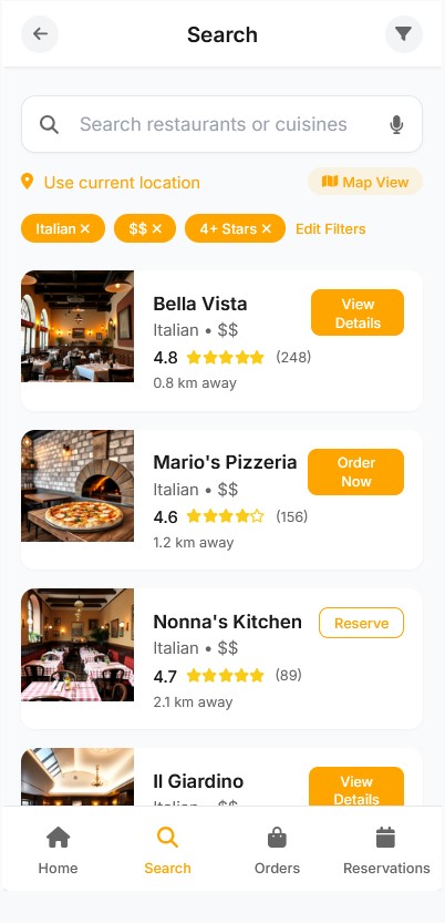
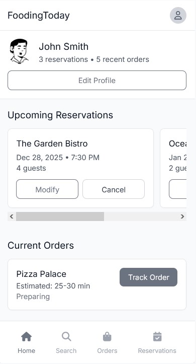
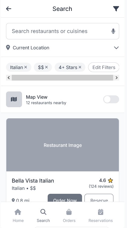
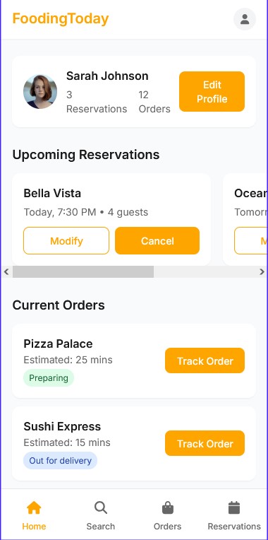
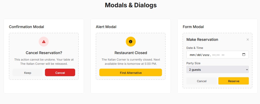
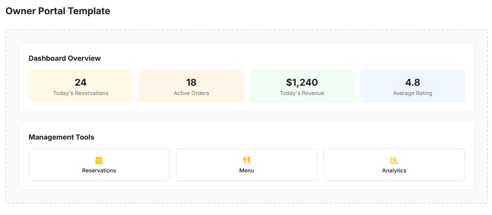
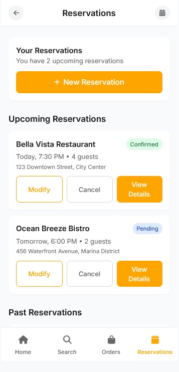
Exploring the user flows built to make searching, booking, and ordering as smooth as possible.
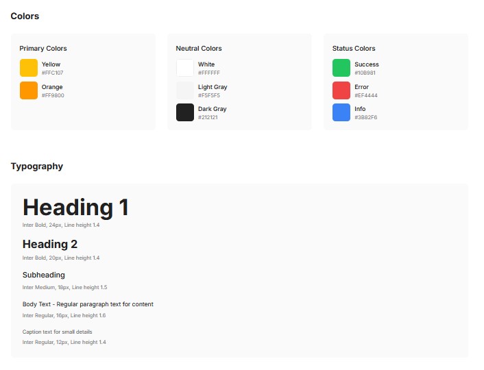
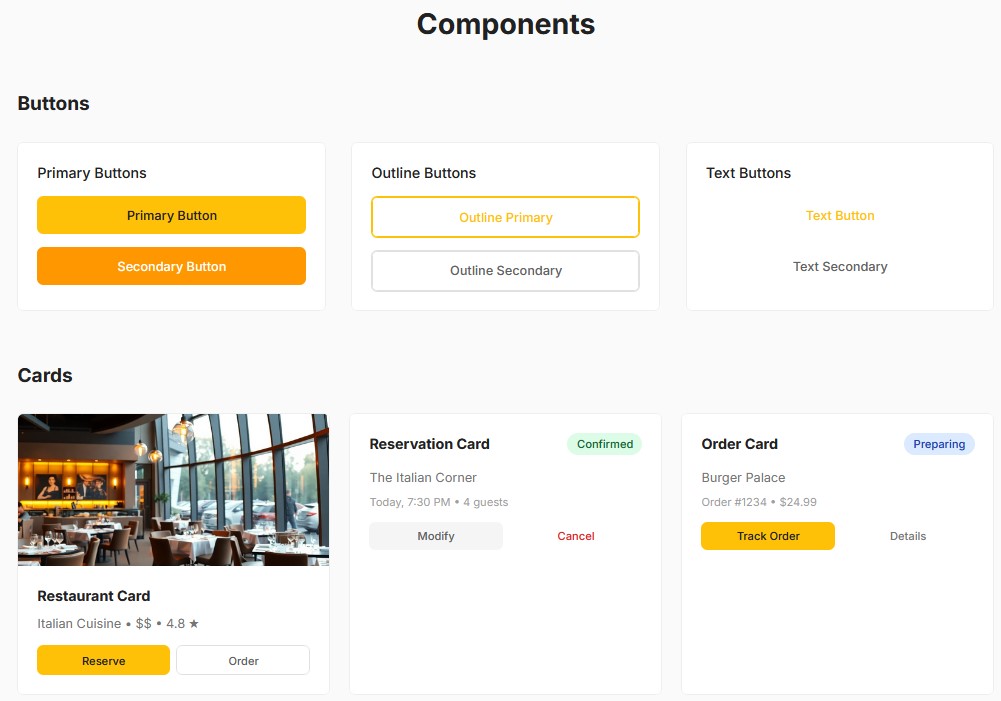
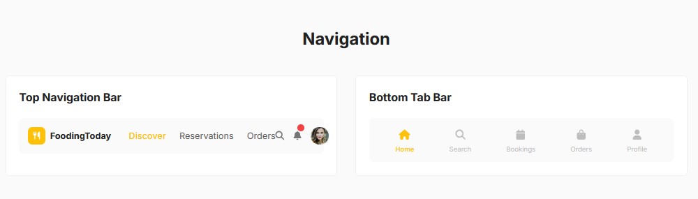
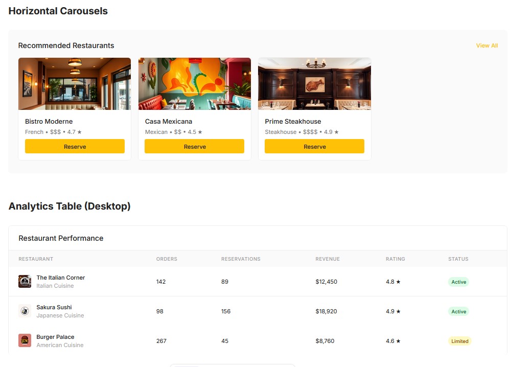
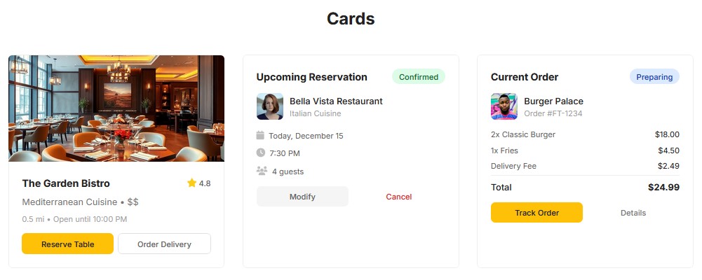
Discovering the clean and appetizing visual style designed to enhance browsing and decision-making.
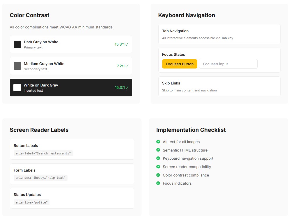
Overview of testing sessions, feedback received, and improvements made to simplify the user journey.
Reflection on the lessons learned about designing for convenience, speed, and trust in food services.
FoodingToday was developed to create a seamless connection between hungry users and restaurants, whether they were looking to dine out, reserve a table, or order food for delivery—all from a single platform.
The goal of FoodingToday was clear:
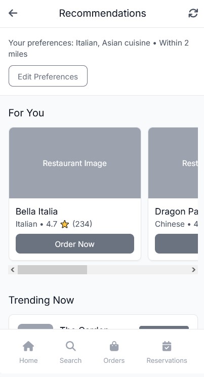
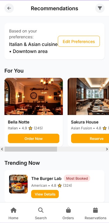
Simplify restaurant discovery with location-based search and personalized recommendations.
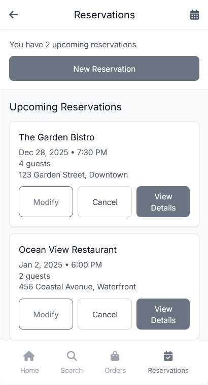
Streamline reservations by allowing users to instantly book a table without phone calls or long wait times.
Make food delivery faster and more reliable, partnering directly with restaurants to avoid third-party delays.
Support restaurant owners by giving them easy tools to manage reservations and deliveries from the same dashboard.
FoodingToday aimed to reduce the friction between finding good food and enjoying it—bringing convenience, choice, and speed into a user-friendly web app designed for both diners and restaurant owners.
To design an app that truly served both diners and restaurants, we started with thorough research focused on real-world needs and habits.
Many participants were frustrated switching between apps for reservations, delivery, and restaurant discovery — they wanted a single, unified platform.
Users expect fast loading times, quick ordering, and seamless checkouts without unnecessary steps.
Most users rely on nearby options and prefer personalized suggestions based on their taste, budget, and dining history.
Photos of dishes and restaurant interiors were often the deciding factor when choosing where to eat.
Users appreciated visible ratings, real reviews, and clear delivery times or reservation confirmations.
Users liked seeing what’s trending locally or what friends recommend, as it made the experience feel more personal and authentic.
These findings guided the core priorities for the app:
Centralizing program creation and client management
Integrating a messaging system directly into the app
Using AI to assist trainers with faster, personalized plan creation
Ensuring clients can easily track their own progress and stay motivated
By directly involving real users early on, the project stayed grounded in solving authentic problems rather than assumptions.
Based on the research insights, the main goal of the UX design was to create a seamless and intuitive experience that connects users with restaurants effortlessly — whether they’re booking a table, exploring nearby spots, or ordering food.
I started by mapping out key user flows for searching restaurants, making reservations, and placing orders, ensuring each step felt natural and required minimal effort. Wireframes were created to establish clear navigation patterns and hierarchy, focusing on clarity, simplicity, and speed.
A major focus was reducing cognitive load by keeping the interface clean and predictable. I prioritized essential actions like “Find Nearby Restaurants” and “Order Again,” making them easily accessible from the home screen.
Usability testing helped refine details such as button placements, information layout, and filters for faster decision-making. Through several iterations, the app’s flow became smoother, helping users achieve their goals with fewer steps.
The final UX structure balances convenience for diners and efficiency for restaurant partners — allowing both sides to interact within a consistent and easy-to-use system.
By continuously iterating on the wireframes and keeping user goals in mind, I was able to design a layout that minimized friction and provided the best flow.
The UI design phase focused on bringing the wireframes to life with a visual style that aligned with the app’s dark mode theme, while maintaining clarity and ease of use. The goal was to create a clean, inviting, and user-friendly interface that encouraged focus without distractions, even in low-light environments.
The UI design phase focused on bringing the wireframes to life with a visual style that aligned with the app’s dark mode theme, while maintaining clarity and ease of use. The goal was to create a clean, inviting, and user-friendly interface that encouraged focus without distractions, even in low-light environments.
I chose a dark theme with black as the primary background color and green as the accent color to evoke energy and motivation. The dark mode reduces eye strain and helps the key elements, like buttons and progress indicators, stand out more clearly. Green was used for key action buttons, highlights, and progress indicators, adding contrast against the darker background for better visibility.
For typography, I selected modern, sans-serif fonts that remain legible in low-light conditions. Lato and Montserrat were used for headings and body text, with subtle weight variations to establish hierarchy and enhance readability.
The app layout is designed to be responsive, adapting seamlessly across different screen sizes, from desktops to tablets and mobile phones. On the trainer dashboard, important metrics and client lists are easy to access, while client progress pages are optimized for clarity. The dark theme enhances the design by reducing distractions, ensuring users can focus on the most essential information without feeling overwhelmed.
I implemented a clear visual hierarchy to help users navigate easily. Key buttons like “Create New Program” were given high contrast with green accents to grab attention, while secondary elements were more muted in gray tones. This approach makes it easy for users to prioritize actions and stay focused on their tasks.
In summary, the dark mode UI design is both visually engaging and functional, offering an immersive experience that maximizes usability while maintaining a sleek, modern look.
Once the high-fidelity prototype was ready, it was time to validate the design with real users through usability testing. The goal was to identify any friction points in the user experience and gather feedback on how trainers and clients interacted with the app. Testing was conducted with professional trainers, some of whom were already managing clients remotely, and a few clients who used fitness apps regularly.
I observed users as they performed these tasks, noting any challenges they faced, confusion with certain features, or frustrations with navigation. Sessions were recorded for analysis, and after each session, I conducted short interviews to gain deeper insights into their experience.
Several important issues and opportunities for improvement were uncovered:
The development of TrainAnywhere was a journey of continuous iteration, collaboration, and user-centered design. Throughout the process, I learned valuable lessons that not only shaped the app but also expanded my design approach.
One of the most important takeaways was the significance of involving real users early in the design process. Collaborating closely with professional trainers gave me deep insights into their daily workflows, pain points, and needs, ensuring that the app would genuinely solve their problems. This approach helped create a design that felt intuitive and practical, rather than hypothetical.
Another key lesson was that simplicity is crucial when designing for busy professionals. By focusing on the core features and minimizing unnecessary complexity, I was able to design an app that trainers could easily navigate, even with little technical expertise. This simplicity also made it easier for clients to stay engaged and motivated, as they could quickly access their workout plans, track progress, and communicate with their trainers.
The testing and feedback phases were critical in refining the app. Usability testing revealed key areas for improvement, such as simplifying the client progress tracking and enhancing mobile responsiveness. Iterating on the design based on these insights ensured the app would meet the users’ expectations and be as functional as possible.
As a fitness app, motivation is central to the user experience. Creating a UI that is visually engaging, yet simple to use, was essential in keeping both trainers and clients motivated. By using the dark mode design with green accents, I was able to strike a balance between functionality and a motivational aesthetic that aligned with the fitness industry’s energetic vibe.
Designing for scalability was another important takeaway. Trainers should be able to expand their businesses and handle more clients without compromising on quality. By automating program creation with AI and integrating real-time progress tracking, the app enabled trainers to efficiently manage multiple clients, giving them the tools to grow their businesses without extra workload.

Contact me
Feel free to reach out — I’ll get back to you shortly.