
Overview: As demand for remote fitness grew, trainers needed a simpler way to manage clients online. TrainAnywhere was built to centralize workouts, nutrition plans, progress and communication in one efficient platform.
Role: UX Researcher, UX/UI designer, Brand designer
Industry: Fitness, Health
Toolkit: Figma, Adobe Photoshop, FigJam
See why TrainAnywhere was created to support online coaching.
How insights from trainers and users shaped the app’s foundation.
Exploring the user flows and structure built for simplicity.
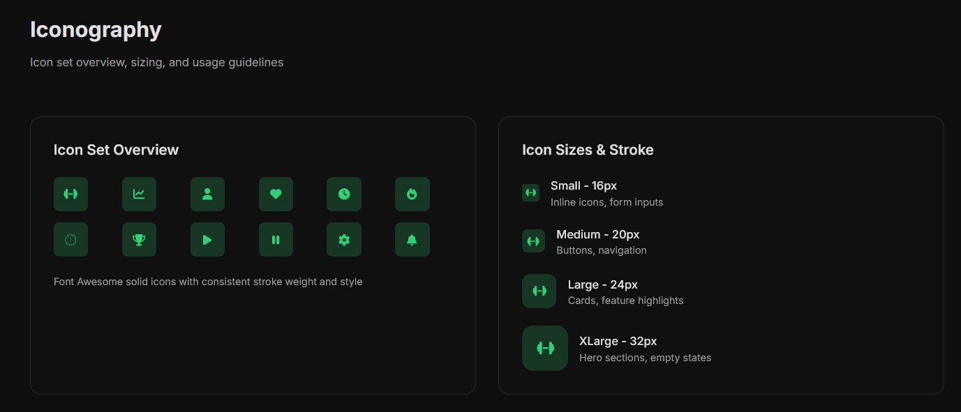
Discovering the visual style designed for clarity and motivation.
Overview of testing sessions, findings, and improvements based on user feedback.
Reflection on main lessons learned throughout the design process.
In today’s digital-first world, personal trainers and nutritionists increasingly need tools to manage their clients remotely. Many were using a mix of spreadsheets, messaging apps, video libraries, and manual tracking, which created a fragmented, time-consuming workflow.
TrainAnywhere was created to solve this problem by providing an all-in-one web application that streamlines program creation, client communication, and progress tracking.
The goal of this project was to design a user-centered platform that empowers trainers to efficiently deliver personalized training and nutrition programs without sacrificing the quality of service.
By combining artificial intelligence, real-time tracking, an integrated video library, and an intuitive messaging system, TrainAnywhere helps trainers scale their businesses, support more clients, and ultimately increase revenue — all while maintaining a personal touch.
The focus was not only on building powerful features but also on ensuring that trainers, regardless of their technical skills, could easily adopt the platform into their daily workflow.
After an initial interview with Marja Savić, a certified fitness trainer and nutrition advisor, several key insights were identified regarding her current digital challenges and user needs.
She manages a large online community and multiple client programs but lacks a unified system to connect workouts, nutrition, and communication in one place.
Marja currently uses multiple apps (Excel, Instagram, WhatsApp) to manage client progress and messages, which consumes too much time and creates data fragmentation.
With a growing audience and community, scaling personalized plans and maintaining consistent quality across clients has become challenging.
Clients often reach out via different platforms, making it difficult to keep track of ongoing conversations and updates.
Both trainers and clients struggle to visually monitor results over time, which impacts motivation and engagement.
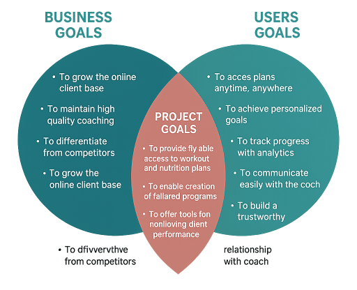
We aimed to validate the insights shared by Marja and understand the deeper needs of both trainers and clients.
The main goal was to define how a single, cohesive platform could support:
Efficient client management for trainers
A transparent, motivating experience for users
Consistent communication and data tracking
Long-term scalability for online fitness coaching
Competitive Analysis
We analyzed existing fitness management platforms such as Trainerize, My PT Hub, and TrueCoach to identify gaps in user experience, personalization, and progress tracking.
Focus areas:
Ease of use for non-technical trainers
Customization of workout and nutrition plans
Visual data feedback and reporting
Client engagement tools
User Interviews
We conducted interviews with 6 participants representing both sides of the system:
2 Fitness Trainers (experienced professionals managing 20+ clients)
2 Active Clients (women using personal coaching programs)
2 New Users (people considering starting an online training program)
All interviews were held remotely via Google Meet, focusing on daily routines, frustrations, and expectations from a digital coaching platform.
Both trainers and clients expressed frustration with using multiple disconnected apps. They need a single, intuitive place that combines planning, messaging, and progress tracking.
While automation and digital tracking are appreciated, users still value the human element — direct feedback from their coach builds trust and motivation.
Trainers want flexible but simple tools. Overly technical systems discourage use and slow down daily operations.
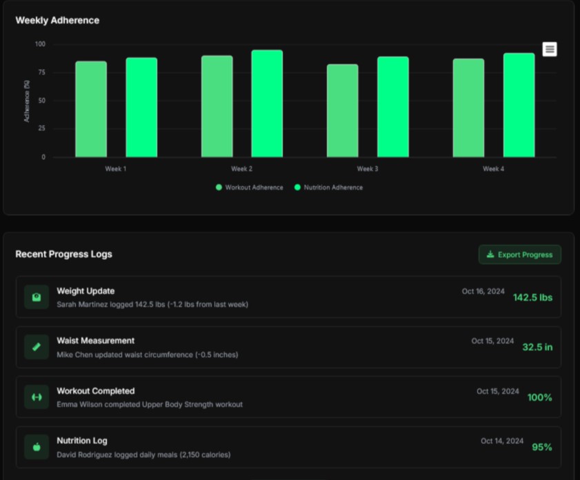
Clients feel more engaged when they can see clear, visual progress (charts, stats, body metrics). Data visualization increases long-term commitment.
Trainers struggle to keep clients consistent when there’s no easy way to track adherence or send automated reminders.
Trainers believe that having access to measurable data (performance, attendance, nutrition adherence) helps them improve their methods and attract more clients.
Bio
Marja is a certified and licensed fitness trainer with over two decades of experience in personal coaching. She’s the founder of Marja Savić Workouts & Nutrition and Marja i Ja, programs focused on empowering women through fitness and healthy living. As a nutrition advisor and fitness influencer, she creates daily online content to motivate her audience and share expert advice. Balancing her career and family life as a mother of three, Marja strives to make wellness accessible and sustainable for women of all backgrounds.
Goals
• To manage her clients and programs efficiently through a single digital platform
• To track client progress and engagement without manual spreadsheets or messages
• To provide personalized training and nutrition plans easily accessible to each client
• To maintain consistent communication and follow-up with clients online
• To grow her online coaching presence and community globally
Frustrations
• She spends too much time switching between apps to manage client messages, workouts, and nutrition updates
• It’s challenging to monitor client consistency and progress without a centralized dashboard
• Manual plan creation and tracking take away time she could spend coaching
• She finds it difficult to personalize plans at scale while keeping each client experience unique
• Technical tools often feel overly complex and not tailored to trainers’ real needs
Bio
Ivan is a licensed personal trainer certified by the National Fitness Association of Serbia and a nutrition advisor accredited by the National Academy of Sports Medicine. His journey began in a small village with no access to gyms — only strong will and determination. From those humble beginnings, he built a career around helping people achieve their best selves through simple, proven methods that fit any lifestyle or experience level.
He started by training clients in person, one at a time, celebrating every success story that came from consistency and effort. Over time, word-of-mouth grew his reputation, leading to a full client base and a mission: to make effective, sustainable fitness available to everyone, regardless of where they start.
Goals
• To make his unique training and nutrition methods available to a wider audience through digital tools
• To easily create, share, and adjust workout and meal plans for different fitness levels
• To keep clients motivated and accountable through progress tracking and personal communication
• To expand his client base beyond his local area with online coaching
• To maintain strong personal connections with clients even when working remotely
Frustrations
• Managing multiple clients manually is time-consuming and difficult to scale
• There is no simple digital solution that combines workouts, nutrition, and communication in one place
• Clients often lose motivation when they can’t easily see or measure their progress
• It’s challenging to provide equal attention to all clients as the number of participants grows
• Many online fitness tools lack the personal touch and flexibility needed for individualized coaching
With a solid understanding of user needs from the research phase, the next step was to design a seamless and intuitive user experience. The primary goal was to create a flow that made it easy for trainers to manage clients, build personalized programs, and track progress, all in one place.
I started by mapping out the user journeys for both trainers and clients, identifying key actions and touchpoints within the app. This involved outlining the steps trainers would take to create a new workout or nutrition plan, communicate with clients, and review progress. For clients, the journey focused on how they would interact with the app to receive their personalized plans, provide feedback, and track their results.
From there, I created low-fidelity wireframes to visualize the basic structure of the app. These wireframes helped establish the core layout, ensuring that the app would be simple and easy to navigate. Key principles considered during this stage were:
By continuously iterating on the wireframes and keeping user goals in mind, I was able to design a layout that minimized friction and provided the best flow for both trainers and clients.
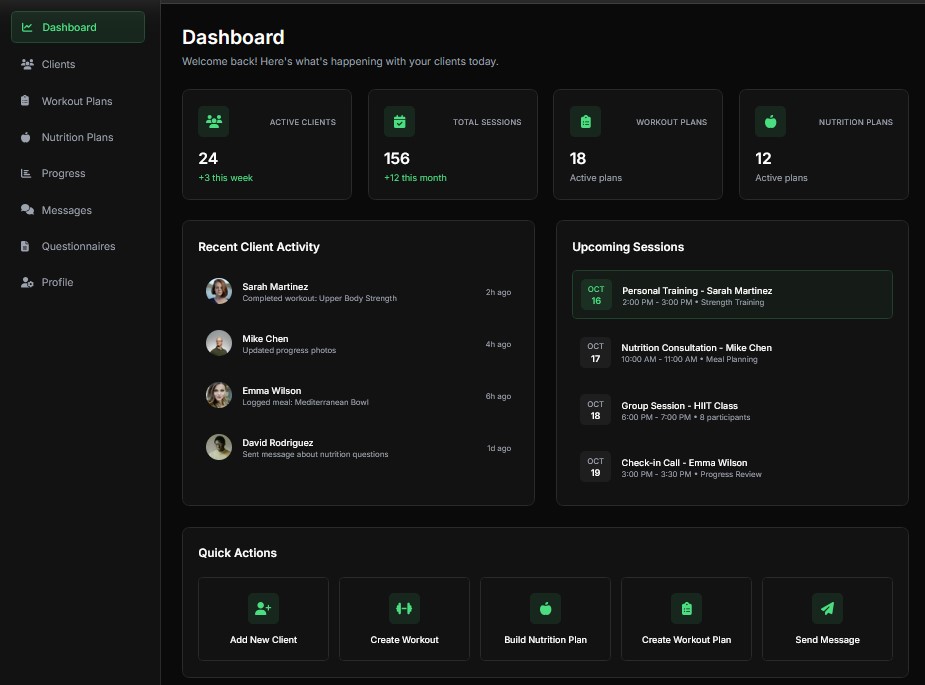
Ensuring users wouldn’t feel overwhelmed by too many options or cluttered screens. Key actions were grouped logically, and the navigation was simplified.
Important tasks, like creating programs or checking client progress, were made easily accessible from the dashboard.
I ensured that similar actions (e.g., adding new exercises or adjusting a workout) were consistent across different parts of the app for a smoother experience.
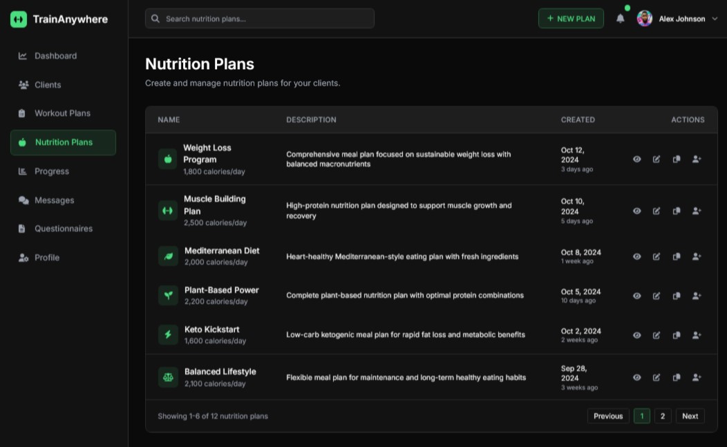
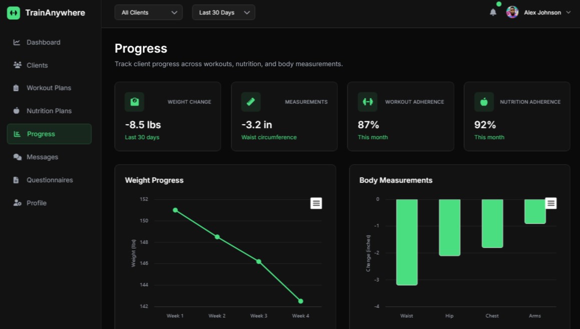
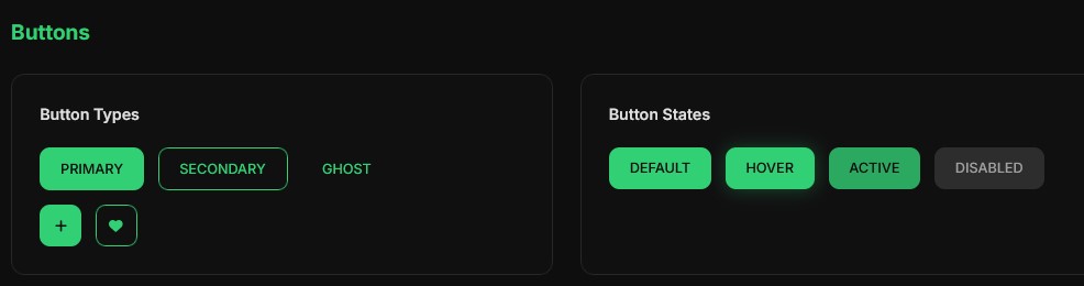
The UI design phase focused on bringing the wireframes to life with a visual style that aligned with the app’s dark mode theme, while maintaining clarity and ease of use. The goal was to create a clean, inviting, and user-friendly interface that encouraged focus without distractions, even in low-light environments.
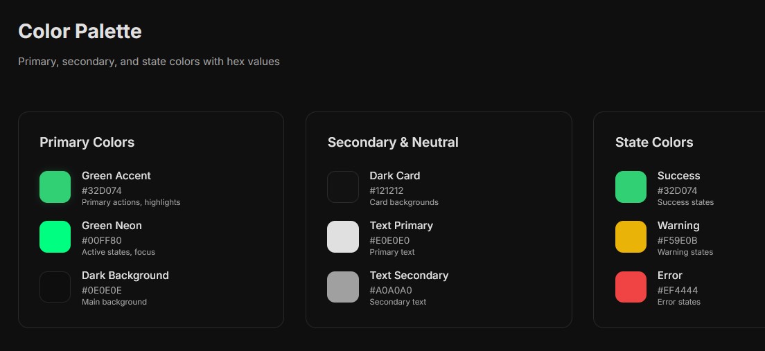
I chose a dark theme with black as the primary background color and green as the accent color to evoke energy and motivation. The dark mode reduces eye strain and helps the key elements, like buttons and progress indicators, stand out more clearly. Green was used for key action buttons, highlights, and progress indicators, adding contrast against the darker background for better visibility.
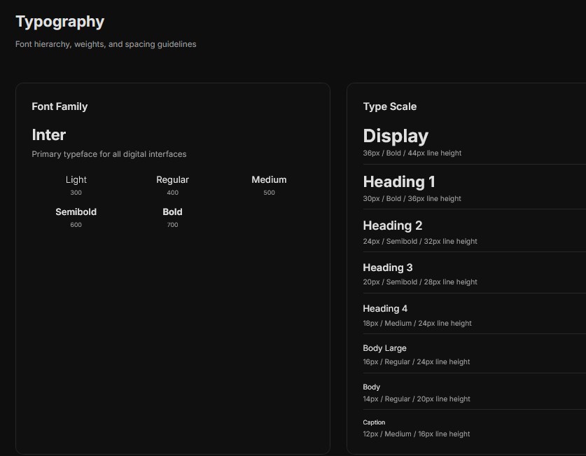
For typography, I selected modern, sans-serif fonts that remain legible in low-light conditions. Lato and Montserrat were used for headings and body text, with subtle weight variations to establish hierarchy and enhance readability.
The app layout is designed to be responsive, adapting seamlessly across different screen sizes, from desktops to tablets and mobile phones. On the trainer dashboard, important metrics and client lists are easy to access, while client progress pages are optimized for clarity. The dark theme enhances the design by reducing distractions, ensuring users can focus on the most essential information without feeling overwhelmed.
Once the high-fidelity prototype was ready, it was time to validate the design with real users through usability testing. The goal was to identify any friction points in the user experience and gather feedback on how trainers and clients interacted with the app. Testing was conducted with professional trainers, some of whom were already managing clients remotely, and a few clients who used fitness apps regularly.
I observed users as they performed these tasks, noting any challenges they faced, confusion with certain features, or frustrations with navigation. Sessions were recorded for analysis, and after each session, I conducted short interviews to gain deeper insights into their experience.
Several important issues and opportunities for improvement were uncovered:
The development of TrainAnywhere was a journey of continuous iteration, collaboration, and user-centered design. Throughout the process, I learned valuable lessons that not only shaped the app but also expanded my design approach.
One of the most important takeaways was the significance of involving real users early in the design process. Collaborating closely with professional trainers gave me deep insights into their daily workflows, pain points, and needs, ensuring that the app would genuinely solve their problems. This approach helped create a design that felt intuitive and practical, rather than hypothetical.
Another key lesson was that simplicity is crucial when designing for busy professionals. By focusing on the core features and minimizing unnecessary complexity, I was able to design an app that trainers could easily navigate, even with little technical expertise. This simplicity also made it easier for clients to stay engaged and motivated, as they could quickly access their workout plans, track progress, and communicate with their trainers.
The testing and feedback phases were critical in refining the app. Usability testing revealed key areas for improvement, such as simplifying the client progress tracking and enhancing mobile responsiveness. Iterating on the design based on these insights ensured the app would meet the users’ expectations and be as functional as possible.
As a fitness app, motivation is central to the user experience. Creating a UI that is visually engaging, yet simple to use, was essential in keeping both trainers and clients motivated. By using the dark mode design with green accents, I was able to strike a balance between functionality and a motivational aesthetic that aligned with the fitness industry’s energetic vibe.
Designing for scalability was another important takeaway. Trainers should be able to expand their businesses and handle more clients without compromising on quality. By automating program creation with AI and integrating real-time progress tracking, the app enabled trainers to efficiently manage multiple clients, giving them the tools to grow their businesses without extra workload.

Contact me
Feel free to reach out — I’ll get back to you shortly.